The last year has been HUGE for us here at Cribl; we’ve seen explosive growth across our business. For those of us in the Product teams, one of the most exciting areas of growth has been the launch of two new ground-breaking products. First, we launched the first fully manageable and auto-configurable agent designed to collect telemetry data at scale – Cribl Edge, which enables customers to move data collection, processing, and routing out into the data source itself. And today we are hitting another milestone with the general availability of Cribl Search, which turns the traditional search process on its head, allowing users to search data wherever it resides.
As our product portfolio grows, we knew we needed to make our user interface (UI) as seamless and consistent as possible. That’s why we’ve combined the product interfaces of Cribl Stream, Edge, and Search into a single, streamlined UI — that’s right. One UI for all of Cribl’s suite of products. Simple, accessible, and user-friendly — get ready for an even better Cribl experience.

A Simple Login Page

We just launched something huge with Cribl.Cloud 4.0 — the ability to integrate with any organization’s existing authentication system. That means you can use your own trusted enterprise identity provider (IDP) and get enhanced security and centralized user and access management. This new feature also comes with a simple, clean, and user-friendly login page, so users get a smooth sign-on experience and can get up and running with Cribl.Cloud immediately.
New Homepage
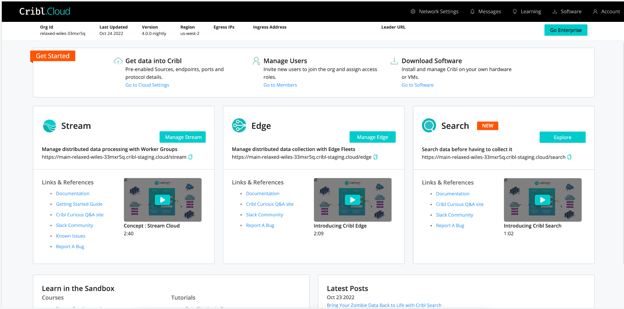
When you land on the new homepage, you’ll immediately see how straightforward it is to access all Cribl products. This makes it easy to navigate to and jumpstart usage without any context switching.

**Note: Cribl Search is currently only available to Cribl.Cloud users. You can sign up and use Search on Cribl.Cloud for free.
Open Working Space
Another thing you’ll notice is we’ve knocked down a few walls and opened up the working space. No walls mean you have more space to work in Cribl and see all of your data sources, routes, pipelines, destinations, monitoring views, FLEETS, WORKER GROUPS, AND SEARCHES! Ok, I’m getting excited, you get the point.
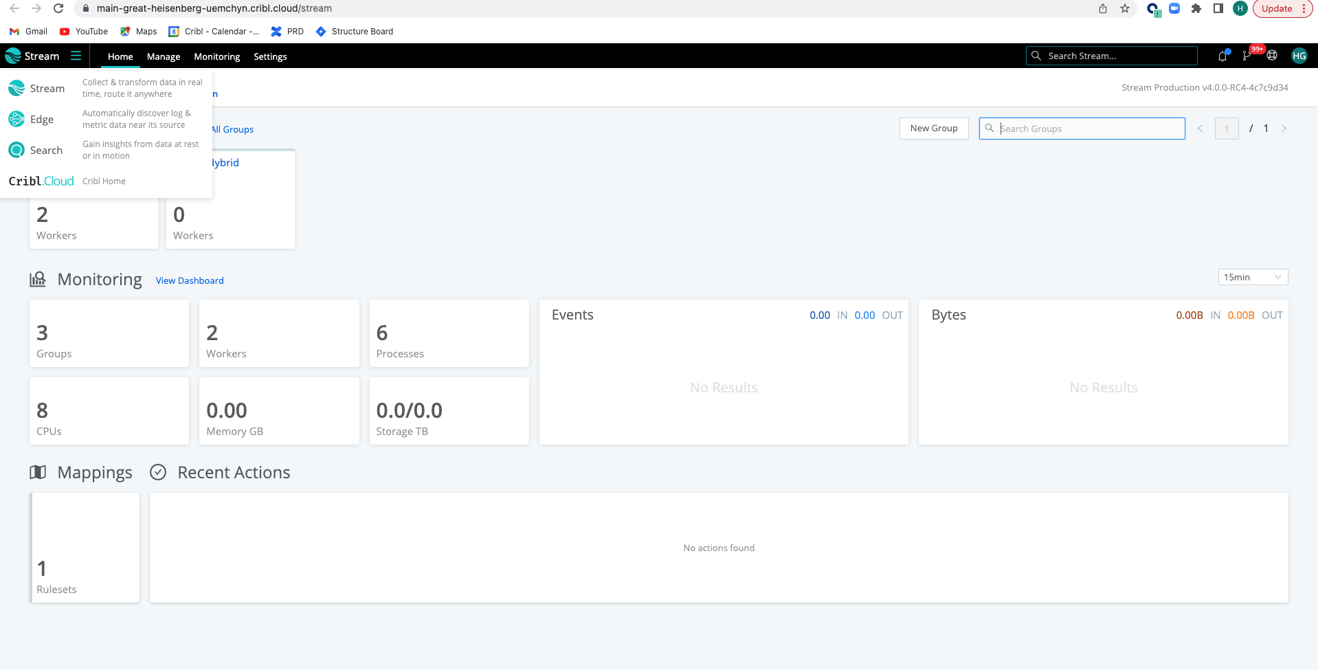
We’ve moved the navigation from the left to the top, maximizing and optimizing screen space where you work. We’ve also added a new quick dropdown menu on the top left of the dashboard, so you can quickly hop over to different Cribl products.
Cribl Stream, Edge, and Search — one big happy family all living together under one roof!

A More Visual Stream

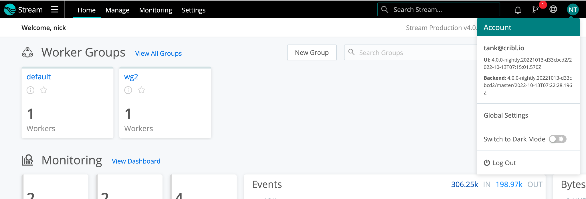
Stream got a minor facelift, nothing drastic; we promise you’ll still recognize the Stream you know and love. We’ve increased font size, and improved contrast, and heightened colors, making it easier to parse information so you can get a high-level view of your entire Stream deployment. Not only that, new Worker Groups can be created directly on the Stream landing page, saving you time and energy.

The navigation bar is to help you move around the Cribl platform effortlessly. Each product now has its own specific navigation items that make sense for the particular product, found in the top horizontal nav. You’ll see the usual Stream options here for managing Workers and Worker Groups, and monitoring your Stream environment as well as new options for Stream-specific settings.
Global settings that carry across all products — think Leader settings, distributed settings, auth, secrets, etc. are all found at the top right, alongside information about the Cribl suite, Dark Mode selection, and the option to log out.

For Stream, product-specific settings are where you will find the Worker upgrade tools:

Leader upgrade is located under the new Global Settings.

We’ve also moved the Leader commit to the top right as well. The commit location for Workers and Worker Groups has stayed the same.
Want to know more details on what’s new with Cribl Stream? Visit the Stream Release blog here
An Enhanced Edge
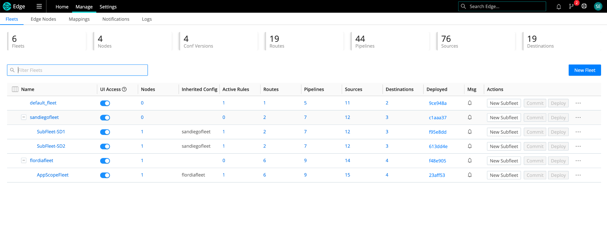
We changed a few things in Cribl Edge as well. As with Cribl Stream, Cribl Edge has its own product settings area where you’ll find Edge fleet upgrade tools.


Perhaps the greatest hype around the upgraded UI for Edge 4.0 is the new Fleet and Subfleet management experience. You can now create child fleets, aka Subfleets, that inherit their configs from their parent fleet — all while maintaining their own specific settings. This makes it easier than ever to manage complex configurations while still being able to update hundreds and thousands of Edge nodes in bulk.

You’ll notice Monitoring has disappeared from the nav bar, as well as a few Edge metrics reporting into Cribl Leader. But don’t worry, these changes aren’t permanent. In an effort to help scale up Edge management, we’ve removed them with the 4.0 release and have plans to bring them back bigger and better in the future.
You can learn more about updates to Edge in our release blog.
Search Joins the Party
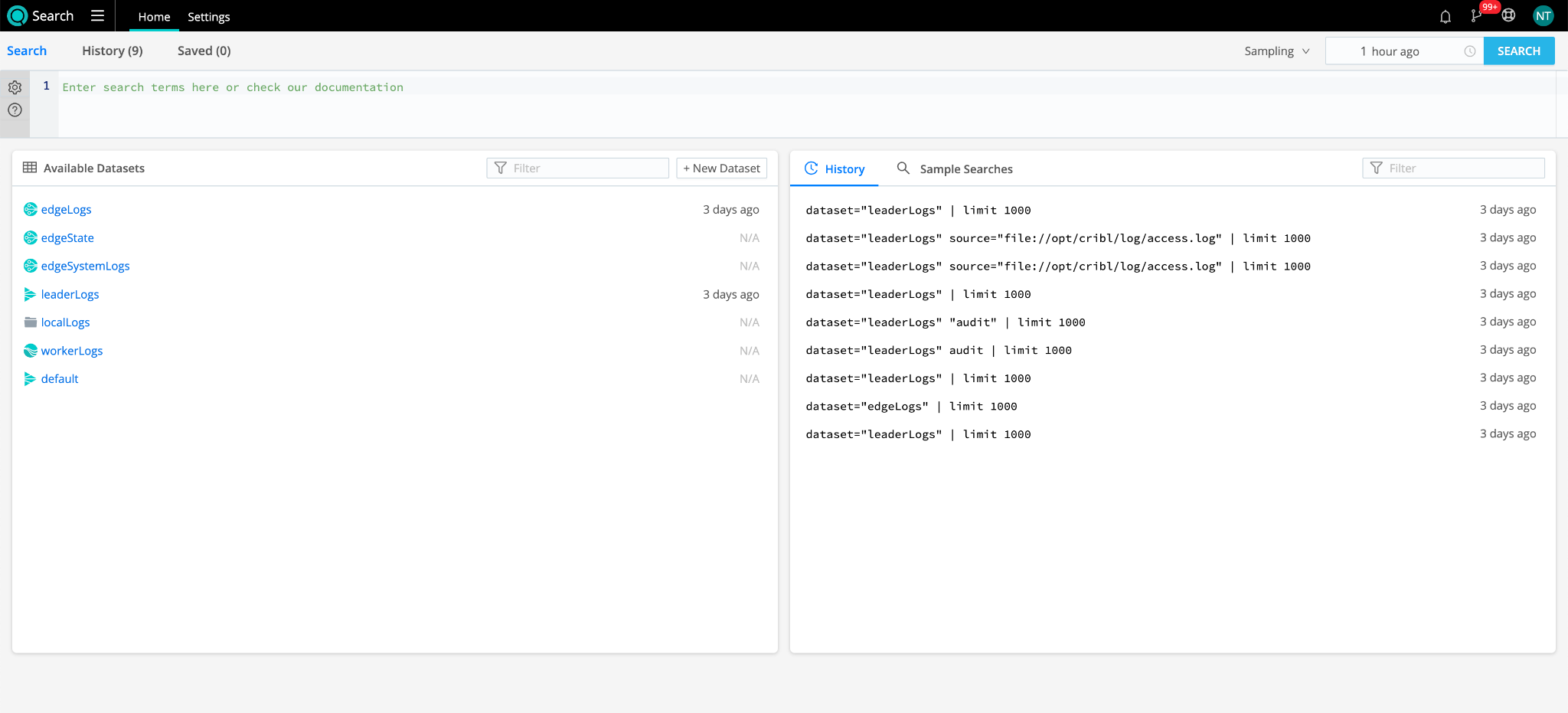
Search is our third child and newest product, and is currently accessible through Cribl.Cloud. If you already have a Cribl.Cloud account, you can start using Cribl Search today! If you don’t, go ahead and sign up so you can start using Search for free. With Search, you can access, search, and explore your data at the source. Query data at rest, at the edge, and AWS S3. No need to bring data back in or store it in local storage.

Search rounds out the entire Cribl product suite. Giving space to Search was one of the main reasons we started on this UX overhaul, a great Search experience requires as much of the screen as you can give it, and we’re letting Cribl Search really own the stage!
Summary
We know these UI updates can take a little getting used to, but we promise it’ll greatly enhance your overall Cribl experience. These changes are minimal and were made to optimize how you work in Stream, Edge, and now Search. Regardless of what device or what size screen you’re using, everything is simple and seamless. The exciting thing is, we’re only just getting started.
We’re stoked about these new UI improvements and will continually make improvements for all our customers.
Cribl suite’s UI changes are but one of the exciting new announcements we have in store for you for this 4.0 release. Sign up for Cribl.Cloud to try our products for free, up to 1TB of data per day! We’d love to hear from you in our community. Join us to learn more about our newest features.
If you’d like to dig deeper, the Cribl Certified Observability Engineer (CCOE) certification program offers free industry-leading observability and security data education and knowledge. It exemplifies one’s commitment to mastering the skills and knowledge required to be a true observability engineer. Create your free Cribl University learner account and start your CCOE certification journey.
More on Cribl’s Fall Launch
Use Cases
Initiatives
Technologies
Industries
RouteOverview
Products
Services
Customer Stories
Customer Highlights




Cribl
Partners
Find a Partner


